library(sf)           # the core spatial data package in R
library(leaflet)      # interactive web maps
library(ggplot2)      # static maps and general plotting
library(dplyr)        # data wrangling
library(rnaturalearth)     # country boundary polygons
library(rnaturalearthdata) # required data for rnaturalearth
library(RColorBrewer)      # colour palettes
library(viridis) # perceptually-uniform colour palettesSpatial Analysis of Soil and Land Health in the Great Green Wall Region (Accra, March 2026)
A tutorial on working with spatial data in R using sf and leaflet


1 Introduction
In this tutorial we work with data extracted from predictive maps built from Land Degradation Surveillance Framework (LDSF) observations across countries along the Great Green Wall (GGW) corridor in Africa. Rather than raw field measurements, each row represents a predicted value at a spatial location, modelled from LDSF survey data.
The dataset includes two tables:
- Land degradation and land cover (
ggw_ldsf_ldlc.csv): site-level estimates of erosion, tree cover, and cropland cover. - Soil health (
ggw_ldsf_soil_health.csv): soil organic carbon (SOC), total nitrogen (TN), pH, sand fraction, and silt fraction.
By the end of this tutorial you will be able to:
- Convert a regular data frame with coordinates into a spatial (
sf) object. - Understand coordinate reference systems (CRS) and why they matter.
- Make publication-quality static maps with
ggplot2andsf. - Build interactive maps with
leaflet, including colour-coded markers, popups, and layer controls. - Perform basic spatial operations such as joining tables and filtering by geography.
2 Getting started
Before working through the sections below, make sure you have the required packages available and the tutorial data stored in the expected folders.
2.1 1. Set up your workspace
We use the following packages. Install any that are missing with install.packages("package_name").
3 Load and explore the data
table_land_health <- read.csv("data/ggw_ldsf_ldlc.csv")
table_soil_health <- read.csv("data/ggw_ldsf_soil_health.csv")
Always start by inspecting the structure and first few rows of your data.
# Dimensions: rows × columns
dim(table_land_health)
[1] 4969 7dim(table_soil_health)[1] 5001 9# Column names and data types
str(table_land_health)'data.frame': 4969 obs. of 7 variables:
$ country : chr "Burkina Faso" "Burkina Faso" "Burkina Faso" "Burkina Faso" ...
$ sample_id : int 1 2 3 4 5 6 7 8 9 10 ...
$ lon : num 0.803 -0.881 -2.238 -4.227 -5.254 ...
$ lat : num 11.9 13.6 13.7 12.5 10.7 ...
$ erosion : int 48 45 45 44 41 57 26 58 22 36 ...
$ tree_cover: int 49 7 19 62 42 32 76 1 72 37 ...
$ cropland : int 14 46 46 13 42 17 33 25 11 43 ...You can also do str(table_soil_health)
# Quick summary statistics
summary(table_land_health)
country sample_id lon lat
Length:4969 Min. : 1.0 Min. :-17.245 Min. :-1.186
Class :character 1st Qu.: 86.0 1st Qu.: -3.055 1st Qu.:10.359
Mode :character Median :193.0 Median : 11.085 Median :13.114
Mean :217.3 Mean : 14.274 Mean :13.137
3rd Qu.:336.0 3rd Qu.: 34.522 3rd Qu.:15.813
Max. :626.0 Max. : 51.103 Max. :24.943
erosion tree_cover cropland
Min. : 2.00 Min. : 1.0 Min. : 1.00
1st Qu.:31.00 1st Qu.:10.0 1st Qu.:21.00
Median :44.00 Median :18.0 Median :32.00
Mean :46.86 Mean :24.2 Mean :40.49
3rd Qu.:65.00 3rd Qu.:32.0 3rd Qu.:61.00
Max. :90.00 Max. :97.0 Max. :92.00 You can also do summary(table_soil_health)
Notice that both tables share the columns country, sample_id, lon, and lat. This gives us the geographic location of every sample point and lets us join the two tables later.
How many unique countries are in the data?
sort(unique(table_land_health$country)) [1] "Burkina Faso" "Chad" "Djibouti" "Eritrea" "Ethiopia"
[6] "Gambia" "Ghana" "Mali" "Mauritania" "Niger"
[11] "Nigeria" "Senegal" "Somalia" "Sudan" Note You may notice both
"Gambia"and"Gambia"in the list. This is a common data-quality issue with country names. We handle it in the filtering step below.
4 Filter to three countries
For this tutorial we focus on Ghana, Nigeria, and Gambia. We use dplyr’s filter() together with %in% to keep only rows whose country value appears in our list.
countries_of_interest <- c("Ghana", "Nigeria", "Gambia")

land_health <- table_land_health |>
  filter(country %in% countries_of_interest)

soil_health <- table_soil_health |>
  filter(country %in% countries_of_interest)

# How many sample points per country?
land_health |> count(country)
country n
1 Gambia 98
2 Ghana 223
3 Nigeria 431soil_health |> count(country) country n
1 Gambia 100
2 Ghana 226
3 Nigeria 4415 What is spatial data? — introducing sf
A plain data frame with lon and lat columns is tabular data that happens to contain coordinates. To do spatial operations — measure distances, overlay maps, reproject — we need to tell R explicitly that those numbers represent locations on the Earth’s surface.
The sf (Simple Features) package represents spatial data as a standard R data frame with an extra geometry column that stores the geographic shape of each row (a point, line, or polygon). All the usual dplyr functions work on sf objects, plus a family of spatial functions prefixed with st_.
5.1 Converting a data frame to an sf point object
land_health_sf <- st_as_sf(
  land_health,
  coords = c("lon", "lat"),   # column names for x (longitude) and y (latitude)
  crs    = 4326               # EPSG code for WGS 84 — the standard GPS coordinate system
)

soil_health_sf <- st_as_sf(
  soil_health,
  coords = c("lon", "lat"),
  crs    = 4326
)
Let’s look at the result:
# The class is now both "sf" and "data.frame"
class(land_health_sf)
[1] "sf" "data.frame"# Head shows the geometry column at the end
head(land_health_sf)Simple feature collection with 6 features and 5 fields
Geometry type: POINT
Dimension: XY
Bounding box: xmin: -16.39218 ymin: 13.27547 xmax: -13.86776 ymax: 13.53946
Geodetic CRS: WGS 84
country sample_id erosion tree_cover cropland geometry
1 Gambia 1 7 69 18 POINT (-13.97316 13.53946)
2 Gambia 3 6 70 16 POINT (-13.86776 13.35587)
3 Gambia 4 2 72 16 POINT (-15.81368 13.31307)
4 Gambia 5 4 61 44 POINT (-14.34357 13.27547)
5 Gambia 6 12 54 15 POINT (-16.08226 13.40727)
6 Gambia 7 10 58 34 POINT (-16.39218 13.33949)# The geometry column type — POINT means each row is a single location
st_geometry_type(land_health_sf) |> unique()[1] POINT
18 Levels: GEOMETRY POINT LINESTRING POLYGON MULTIPOINT ... TRIANGLE5.2 Understanding the coordinate reference system (CRS)
A CRS defines how coordinates map onto the curved surface of the Earth. Always check the CRS of your data before doing anything spatial.
st_crs(land_health_sf)Coordinate Reference System:
User input: EPSG:4326
wkt:
GEOGCRS["WGS 84",
ENSEMBLE["World Geodetic System 1984 ensemble",
MEMBER["World Geodetic System 1984 (Transit)"],
MEMBER["World Geodetic System 1984 (G730)"],
MEMBER["World Geodetic System 1984 (G873)"],
MEMBER["World Geodetic System 1984 (G1150)"],
MEMBER["World Geodetic System 1984 (G1674)"],
MEMBER["World Geodetic System 1984 (G1762)"],
MEMBER["World Geodetic System 1984 (G2139)"],
ELLIPSOID["WGS 84",6378137,298.257223563,
LENGTHUNIT["metre",1]],
ENSEMBLEACCURACY[2.0]],
PRIMEM["Greenwich",0,
ANGLEUNIT["degree",0.0174532925199433]],
CS[ellipsoidal,2],
AXIS["geodetic latitude (Lat)",north,
ORDER[1],
ANGLEUNIT["degree",0.0174532925199433]],
AXIS["geodetic longitude (Lon)",east,
ORDER[2],
ANGLEUNIT["degree",0.0174532925199433]],
USAGE[
SCOPE["Horizontal component of 3D system."],
AREA["World."],
BBOX[-90,-180,90,180]],
ID["EPSG",4326]]EPSG:4326 (also called WGS 84) uses degrees of longitude and latitude. It is the system used by GPS devices and is the default for most web mapping services. Whenever you read coordinates from a CSV file you should almost always set crs = 4326.
5.3 Bounding box — where is the data?
st_bbox(land_health_sf) xmin ymin xmax ymax
-16.750094 4.466413 14.579271 13.770503 This tells us the minimum and maximum longitude (xmin, xmax) and latitude (ymin, ymax) of the dataset — useful for setting map extents.
6 Static maps with ggplot2
ggplot2 gained native support for sf objects through geom_sf(). Pair that with country boundaries from rnaturalearth and you get a proper cartographic basemap.
6.1 Download country boundaries
# Download African country polygons at medium resolution
africa <- ne_countries(
  continent = "africa",
  scale      = "medium",
  returnclass = "sf"      # return as sf, not Spatial
)

# Keep only the three countries we are analysing
focus_countries <- africa |>
  filter(name %in% c("Ghana", "Nigeria", "Gambia"))
6.2 A simple dot map
ggplot() +
  geom_sf(data = africa, fill = "grey95", colour = "grey60", linewidth = 0.3) +
  geom_sf(data = focus_countries, fill = "lightyellow", colour = "grey40",
          linewidth = 0.5) +
  geom_sf(data = land_health_sf, colour = "firebrick", size = 1.5, alpha = 0.6) +
  coord_sf(xlim = c(-20, 20), ylim = c(3, 16)) +  # crop to region of interest
  labs(
    title    = "LDSF Sample Points — Ghana, Nigeria & Gambia",
    subtitle = "Land and landscape condition survey",
    x = "Longitude", y = "Latitude",
    caption  = "Data: LDSF / World Agroforestry (CIFOR-ICRAF)"
  ) +
  theme_bw()
ggsave("figs/ggplot_sample_points.png", width = 6, height = 4, dpi = 300)6.3 Colour points by a variable
We can encode a variable such as tree_cover using the colour aesthetic. scale_colour_viridis_c() uses a perceptually-uniform palette that is also colourblind-friendly.
ggplot() +
  geom_sf(data = africa, fill = "grey95", colour = "grey70", linewidth = 0.3) +
  geom_sf(data = focus_countries, fill = "lightyellow", colour = "grey40",
          linewidth = 0.5) +
  geom_sf(data = land_health_sf, aes(colour = tree_cover), size = 2, alpha = 0.8) +
  scale_colour_viridis_c(name = "Tree cover (%)", option = "D", direction = -1) +
  coord_sf(xlim = c(-20, 20), ylim = c(3, 16)) +
  labs(
    title   = "Tree Cover at LDSF Sample Points",
    x = "Longitude", y = "Latitude",
    caption = "Data: LDSF / World Agroforestry (CIFOR-ICRAF)"
  ) +
  theme_bw()
ggsave("figs/ggplot_tree_cover.png", width = 6, height = 4, dpi = 300)7 Interactive maps with leaflet
leaflet creates interactive HTML maps that let you zoom, pan, and click on features. Unlike ggplot2, leaflet renders in the browser rather than as a static image — ideal for exploring data or sharing with stakeholders.
7.1 A minimal leaflet map
leaflet(data = land_health_sf) |>
  addTiles() |>                          # adds the default OpenStreetMap basemap
  addCircleMarkers(
    radius = 4,
    color  = "steelblue",
    stroke = FALSE,
    fillOpacity = 0.8
  )
Tip
addTiles()without arguments uses OpenStreetMap. You can swap in a different basemap — see Section Section 7.6.
7.2 Adding popups
Popups appear when you click on a marker and can display any HTML content.
leaflet(data = land_health_sf) |>
  addTiles() |>
  addCircleMarkers(
    radius = 4,
    color  = "steelblue",
    stroke = FALSE,
    fillOpacity = 0.8,
    popup = ~paste0(
      "<b>Country:</b> ", country, "<br>",
      "<b>Sample ID:</b> ", sample_id, "<br>",
      "<b>Tree cover:</b> ", tree_cover, "%<br>",
      "<b>Erosion:</b> ", erosion, "%<br>",
      "<b>Cropland:</b> ", cropland, "%"
    )
  )
7.3 Colour-coded markers
To show the spatial pattern of a continuous variable, we map values to colours using one of leaflet’s colour functions:
| Function | Best for |
|---|---|
colorNumeric() |
Continuous data with a smooth gradient |
colorBin() |
Continuous data divided into discrete bins |
colorQuantile() |
When you want equal numbers of points per class |
colorFactor() |
Categorical (factor) data |
# Create a colour palette for soil organic carbon
pal_soc <- colorNumeric(
  palette = "YlOrRd",
  domain  = soil_health_sf$soc,
  na.color = "grey"
)

leaflet(data = soil_health_sf) |>
  addProviderTiles("CartoDB.Positron") |>
  addCircleMarkers(
    radius      = 5,
    color       = ~pal_soc(soc),
    stroke      = FALSE,
    fillOpacity = 0.85,
    popup = ~paste0(
      "<b>Country:</b> ", country, "<br>",
      "<b>SOC:</b> ", round(soc, 2), " g/kg<br>",
      "<b>Total N:</b> ", round(tn, 2), " g/kg<br>",
      "<b>Soil pH:</b> ", round(soil_pH, 2)
    ),
    label = ~paste0("SOC: ", round(soc, 1), " g/kg")
  ) |>
  addLegend(
    position = "bottomright",
    pal      = pal_soc,
    values   = ~soc,
    title    = "Soil Organic Carbon<br>(g/kg)",
    opacity  = 0.8
  )
7.4 Using bins for clearer class breaks
pal_erosion <- colorBin(
  palette = "Reds",
  domain  = land_health_sf$erosion,
  bins    = c(0, 25, 50, 75, 100),
  reverse = TRUE   # red = high erosion
)

leaflet(data = land_health_sf) |>
  addProviderTiles("CartoDB.Positron") |>
  addCircleMarkers(
    radius      = 5,
    color       = ~pal_erosion(erosion),
    stroke      = FALSE,
    fillOpacity = 0.85,
    popup = ~paste0(
      "<b>Country:</b> ", country, "<br>",
      "<b>Erosion:</b> ", erosion, "%<br>",
      "<b>Tree cover:</b> ", tree_cover, "%"
    )
  ) |>
  addLegend(
    position = "bottomright",
    pal      = pal_erosion,
    values   = ~erosion,
    title    = "Erosion (%)",
    opacity  = 0.8
  )
7.5 Layer controls — toggling multiple datasets
addLayersControl() lets users switch between overlay layers, which is useful when you want to compare variables on the same map.
pal_tree <- colorNumeric("Greens", domain = land_health_sf$tree_cover)
pal_crop  <- colorNumeric("Blues",  domain = land_health_sf$cropland)

leaflet() |>
  addProviderTiles("CartoDB.Positron", group = "CartoDB") |>
  addProviderTiles("OpenStreetMap",    group = "OpenStreetMap") |>

  # Layer 1: tree cover
  addCircleMarkers(
    data        = land_health_sf,
    group       = "Tree Cover",
    radius      = 5,
    color       = ~pal_tree(tree_cover),
    stroke      = FALSE,
    fillOpacity = 0.85,
    popup = ~paste0("<b>Tree cover:</b> ", tree_cover, "%")
  ) |>
  addLegend(
    position = "bottomleft",
    pal      = pal_tree,
    values   = land_health_sf$tree_cover,
    title    = "Tree Cover (%)",
    group    = "Tree Cover"
  ) |>

  # Layer 2: cropland
  addCircleMarkers(
    data        = land_health_sf,
    group       = "Cropland",
    radius      = 5,
    color       = ~pal_crop(cropland),
    stroke      = FALSE,
    fillOpacity = 0.85,
    popup = ~paste0("<b>Cropland:</b> ", cropland, "%")
  ) |>
  addLegend(
    position = "bottomright",
    pal      = pal_crop,
    values   = land_health_sf$cropland,
    title    = "Cropland (%)",
    group    = "Cropland"
  ) |>

  addLayersControl(
    baseGroups    = c("CartoDB", "OpenStreetMap"),
    overlayGroups = c("Tree Cover", "Cropland"),
    options       = layersControlOptions(collapsed = FALSE)
  )
7.6 Alternative basemaps
addProviderTiles() gives access to dozens of pre-configured tile providers. Some useful ones for ecological work:
# Satellite imagery
leaflet(data = soil_health_sf) |>
  addProviderTiles("Esri.WorldImagery") |>
  addCircleMarkers(radius = 4, color = "yellow", stroke = FALSE, fillOpacity = 0.9,
                   label = ~country)
Common provider names:
| Provider string | Description |
|---|---|
"OpenStreetMap" |
Standard OSM |
"CartoDB.Positron" |
Clean light basemap |
"CartoDB.DarkMatter" |
Dark background |
"Esri.WorldImagery" |
Satellite imagery |
"Esri.WorldTopoMap" |
Topographic |
"Stamen.Terrain" |
Terrain (requires Stadia key) |
8 Joining the two datasets
Both tables share sample_id and country. We can combine them with inner_join() to work with land health and soil variables in the same object.
# Join as plain data frames first, then convert to sf
combined <- inner_join(
  land_health,
  soil_health |> select(sample_id, country, soc, tn, soil_pH, sand, silt),
  by = c("sample_id", "country")
)
Warning in inner_join(land_health, select(soil_health, sample_id, country, : Detected an unexpected many-to-many relationship between `x` and `y`.
ℹ Row 1 of `x` matches multiple rows in `y`.
ℹ Row 1 of `y` matches multiple rows in `x`.
ℹ If a many-to-many relationship is expected, set `relationship =
"many-to-many"` to silence this warning.nrow(land_health); nrow(soil_health); nrow(combined)[1] 752[1] 767[1] 850# Convert to sf
combined_sf <- st_as_sf(combined, coords = c("lon", "lat"), crs = 4326)
head(combined_sf)Simple feature collection with 6 features and 10 fields
Geometry type: POINT
Dimension: XY
Bounding box: xmin: -15.81368 ymin: 13.31307 xmax: -13.86776 ymax: 13.53946
Geodetic CRS: WGS 84
country sample_id erosion tree_cover cropland soc tn soil_pH sand silt
1 Gambia 1 7 69 18 12.95 1.50 6.47 42.60 20.67
2 Gambia 1 7 69 18 15.23 1.72 6.10 37.23 22.77
3 Gambia 3 6 70 16 9.17 0.95 6.49 52.24 17.40
4 Gambia 3 6 70 16 10.89 1.21 6.46 41.38 21.54
5 Gambia 4 2 72 16 12.97 1.51 6.11 45.30 22.51
6 Gambia 4 2 72 16 13.46 1.57 6.22 40.06 22.61
geometry
1 POINT (-13.97316 13.53946)
2 POINT (-13.97316 13.53946)
3 POINT (-13.86776 13.35587)
4 POINT (-13.86776 13.35587)
5 POINT (-15.81368 13.31307)
6 POINT (-15.81368 13.31307)Now we can explore relationships — for example, is soil organic carbon related to tree cover?
ggplot(combined, aes(x = tree_cover, y = soc, colour = country)) +
  geom_point(alpha = 0.6, size = 2) +
  geom_smooth(method = "lm", se = TRUE, linewidth = 1) +
  scale_colour_brewer(palette = "Set1", name = "Country") +
  labs(
    title = "Soil Organic Carbon vs Tree Cover",
    x     = "Tree cover (%)",
    y     = "Soil organic carbon (g/kg)"
  ) +
  theme_bw()
`geom_smooth()` using formula = 'y ~ x'Warning: Removed 1 row containing non-finite outside the scale range
(`stat_smooth()`).Warning: Removed 1 row containing missing values or values outside the scale range
(`geom_point()`).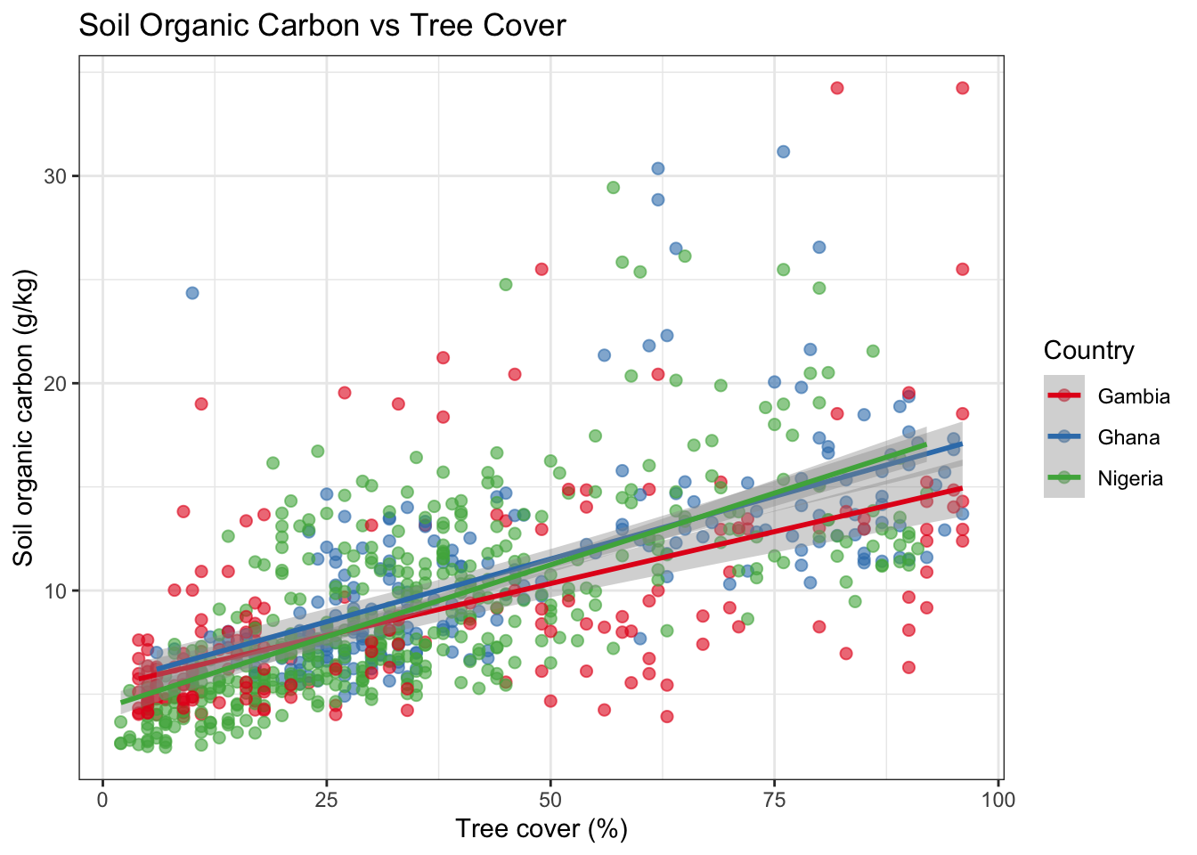
ggplot(combined, aes(x = sand, y = soc, colour = country)) +
  geom_point(alpha = 0.6, size = 2) +
  geom_smooth(method = "lm", se = TRUE, linewidth = 1) +
  scale_colour_brewer(palette = "Set1", name = "Country") +
  labs(
    title = "Soil Organic Carbon vs Sand Content",
    x     = "Sand (%)",
    y     = "Soil organic carbon (g/kg)"
  ) +
  theme_bw()
`geom_smooth()` using formula = 'y ~ x'Warning: Removed 1 row containing non-finite outside the scale range
(`stat_smooth()`).Warning: Removed 1 row containing missing values or values outside the scale range
(`geom_point()`).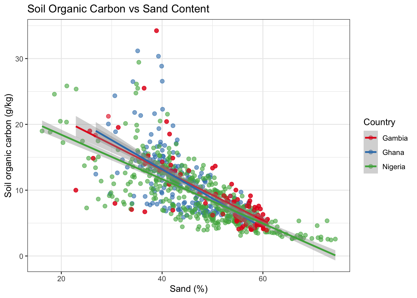
And map both variables together using a bivariate-style popup:
pal_soc2 <- colorNumeric("YlOrRd", domain = combined_sf$soc, na.color = "grey80")

leaflet(data = combined_sf) |>
  addProviderTiles("CartoDB.Positron") |>
  addCircleMarkers(
    radius      = ~scales::rescale(tree_cover, to = c(3, 10)),  # size = tree cover
    color       = ~pal_soc2(soc),                                # colour = SOC
    stroke      = TRUE,
    weight      = 1,
    fillOpacity = 0.8,
    popup = ~paste0(
      "<b>Country:</b> ", country, "<br>",
      "<b>Tree cover:</b> ", tree_cover, "%<br>",
      "<b>SOC:</b> ", round(soc, 2), " g/kg<br>",
      "<b>Erosion:</b> ", erosion, "%"
    )
  ) |>
  addLegend("bottomright", pal = pal_soc2, values = ~soc,
            title = "SOC (g/kg)", opacity = 0.8)
What you see: Each circle’s size encodes tree cover, while its colour encodes soil organic carbon. Points that are large and dark orange tend to have both high tree cover and high SOC — consistent with trees contributing organic matter to the soil.
9 Spatial operations with sf
9.1 Computing centroids per country
# Dissolve points to country-level bounding boxes / convex hulls
by_country <- land_health_sf |>
  group_by(country) |>
  summarise(
    n_sites    = n(),
    mean_erosion   = mean(erosion, na.rm = TRUE),
    mean_tree_cover = mean(tree_cover, na.rm = TRUE),
    geometry   = st_union(geometry)   # union all points into a MULTIPOINT
  )

by_country
Simple feature collection with 3 features and 4 fields
Geometry type: MULTIPOINT
Dimension: XY
Bounding box: xmin: -16.75009 ymin: 4.466413 xmax: 14.57927 ymax: 13.7705
Geodetic CRS: WGS 84
# A tibble: 3 × 5
country n_sites mean_erosion mean_tree_cover geometry
<chr> <int> <dbl> <dbl> <MULTIPOINT [°]>
1 Gambia 98 8.07 34.4 ((-16.74766 13.4059), (-16.62508…
2 Ghana 223 28.8 46.0 ((-0.15277 11.1108), (-0.1298565…
3 Nigeria 431 34.4 35.4 ((3.395582 8.112679), (3.459889 …# Compute the centroid of each country's sample cloud
centroids <- st_centroid(by_country)
ggplot() +
geom_sf(data = africa, fill = "grey95", colour = "grey70", linewidth = 0.3) +
geom_sf(data = land_health_sf, colour = "grey60", size = 1, alpha = 0.5) +
geom_sf(data = centroids, aes(size = n_sites, colour = mean_erosion), alpha = 0.9) +
scale_colour_distiller("Mean erosion (%)", palette = "YlOrRd", direction = 1) +
scale_size_continuous("Number of sites", range = c(4, 12)) +
coord_sf(xlim = c(-20, 20), ylim = c(3, 16)) +
labs(title = "Country-level Summary of LDSF Samples") +
theme_bw()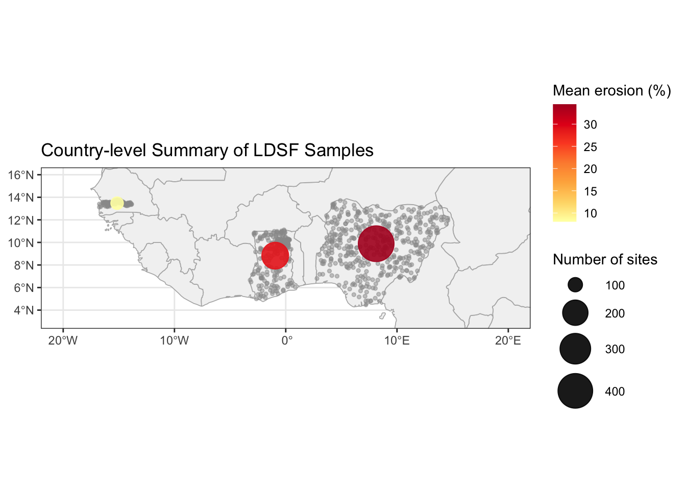
9.2 Clipping points to a country polygon
st_filter() (or st_intersection()) returns only the features that fall within a given polygon — useful when your point cloud contains stray coordinates.
ghana_boundary <- africa |> filter(name == "Ghana")

ghana_points <- st_filter(land_health_sf, ghana_boundary)

nrow(land_health_sf |> filter(country == "Ghana"))  # points labelled "Ghana"
[1] 223nrow(ghana_points) # points actually inside Ghana boundary[1] 22310 Exporting spatial data
sf can read and write many spatial formats. GeoPackage (.gpkg) is a modern, open single-file format recommended over Shapefile.
# Write to GeoPackage
st_write(combined_sf, "data/ldsf_combined.gpkg", delete_dsn = TRUE)

# Read back
ldsf_reloaded <- st_read("data/ldsf_combined.gpkg")
To export to CSV (dropping spatial information):
# Add coordinates back as columns before writing
combined_with_coords <- combined_sf |>
  mutate(
    lon = st_coordinates(geometry)[, 1],
    lat = st_coordinates(geometry)[, 2]
  ) |>
  st_drop_geometry()

write.csv(combined_with_coords, "data/ldsf_combined_export.csv", row.names = FALSE)
11 Bonus: Modelling soil organic carbon
This section is a bonus — work through it if time allows.
Now that we have a combined dataset we can ask a more formal question: which landscape and soil variables predict soil organic carbon (SOC), once we account for the fact that our observations come from three different countries?
Our points are grouped by country. Points from the same country share unmeasured factors — climate, land-use history, soil parent material — that make them more alike than points from different countries. Ignoring this structure would inflate our confidence in the predictor estimates. We therefore fit a linear mixed-effects model using lmer from lme4, adding country as a random intercept: each country gets its own SOC baseline, while the fixed-effect slopes are shared across the full dataset.
12 Summary
In this tutorial you learned how to:
| Task | Key function |
|---|---|
| Convert a CSV with coordinates to spatial data | st_as_sf() |
| Check the coordinate reference system | st_crs() |
| Get the geographic extent of a dataset | st_bbox() |
| Make static maps | geom_sf() in ggplot2 |
| Build interactive maps | leaflet() + addCircleMarkers() |
| Map values to colours | colorNumeric(), colorBin(), colorFactor() |
| Add popups and labels | popup =, label = arguments |
| Toggle layers interactively | addLayersControl() |
| Join spatial and non-spatial data | inner_join() + st_as_sf() |
| Aggregate geometries | st_union(), st_centroid() |
| Clip points to a polygon | st_filter() |
| Export to GeoPackage | st_write() |
12.1 Things to try next
- Change the colour palette in one of the leaflet maps. Browse available palettes with
RColorBrewer::display.brewer.all(). - Add a third overlay layer (e.g. soil pH) to the layer-control map in Section Section 7.5.
- Filter the data to a single country and make a detailed leaflet map with satellite imagery.
- Try
colorQuantile()instead ofcolorNumeric()for SOC. How does the map look different? - Export
combined_sfto a GeoPackage and open it in QGIS.